CO-SPEND
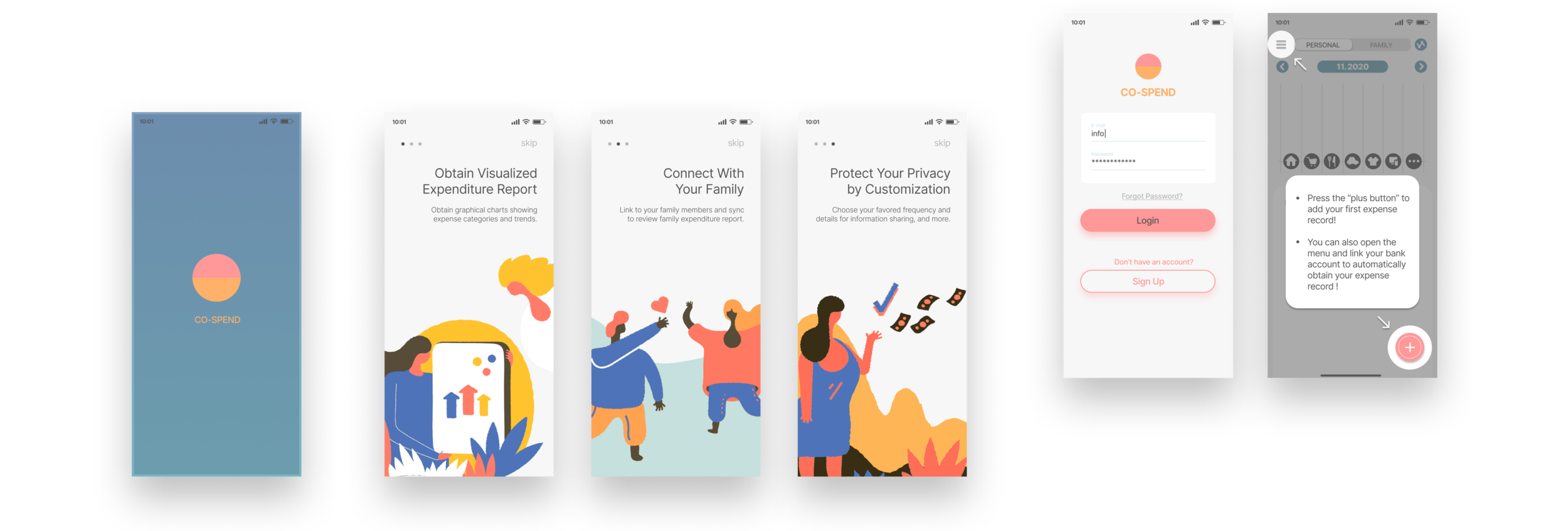
CO-SPEND is a financial tool that generates visualized financial reports for young couples to track their shared expenses as well as changes in life.
2020, side project
Author / Independent
Keywords / UIUX design
Design Goal
There are numerous personal finance apps on the market, but very few can offer clear reports and diagrams of shared expenses. Meanwhile, many new couples, have to turn to Excel to track their total expenditure when they want to track their family expenditure. Co-Spend is a financial tool to help young couples track their family expenditure and review visualized reports with diagrams at ease. This app was aimed to provide an easy solution for these conditions. It will also help strengthen the bond between the family members while offering them a financial-related history of their own.
Target Group Interview | Affinity Diagram
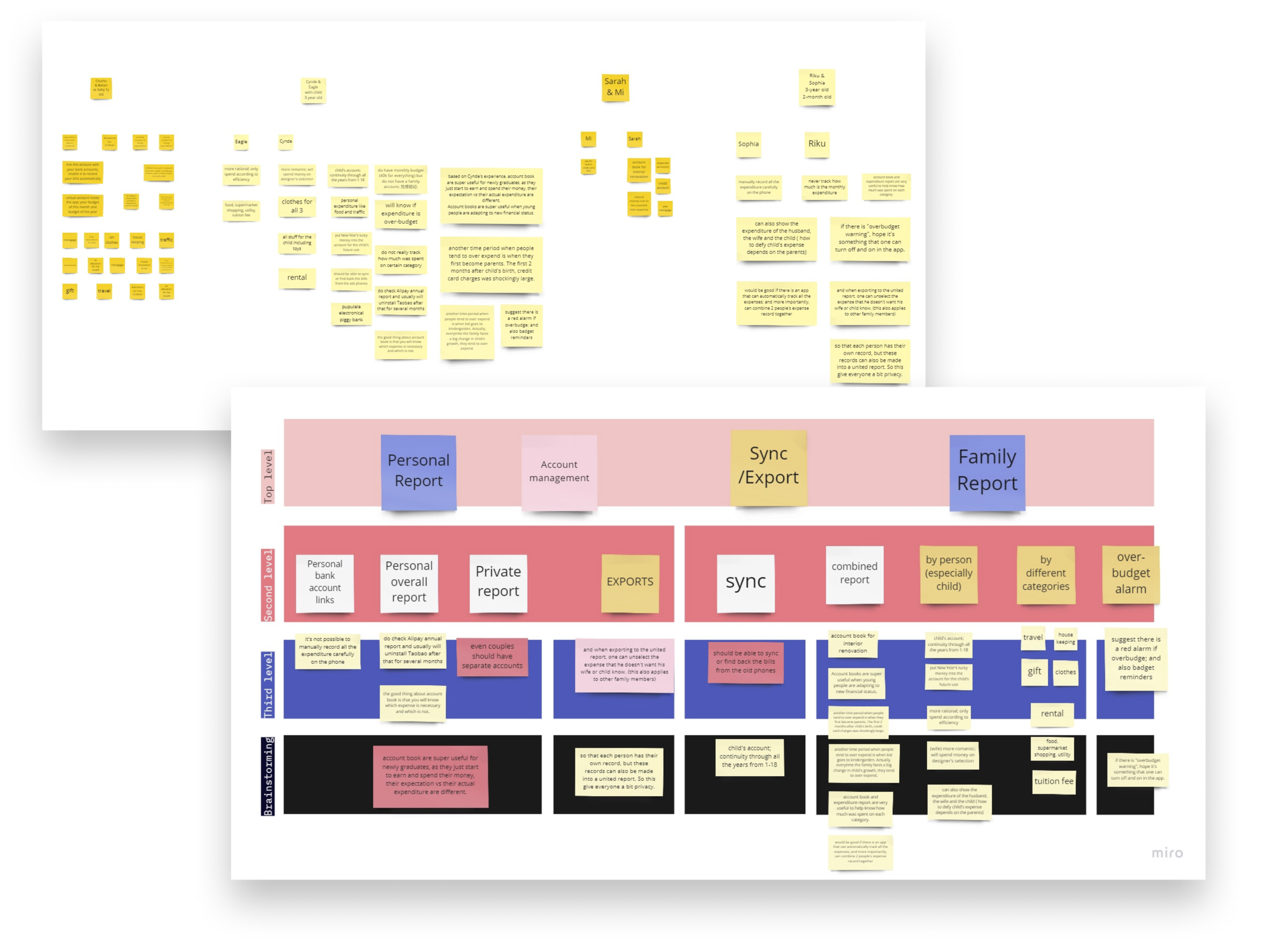
I interviewed 4 persons from different families, including 2 husbands and 2 wives. 3 of them had 1-2 children from 0-6 years old. In the interviews, most of them seem to be interested, or admited it would be useful in certain stages. All the notes of demands and concerns in the interview formed the Affinity diagram and Persona, which was a pair of young couple.
Main Insights
1) The demand of tracking family expenditure was the highest when refurnishing their house, raising babies or planning for kids’ tuition and school supplies. In other words, when their lives changed because of the development of their relationship/marriage life.
2) While interviewers hold a welcoming attitude for the idea of family financial report, many of them still concerned about their privacy. Because most of people would prefer import expense record directly from bank accounts, over detailed sharing of these information could lead to family conflict which can otherwise be avoid. Different levels of privacy should be designed in the app for people to feel more at ease when using this app.
Sketch Prototypes
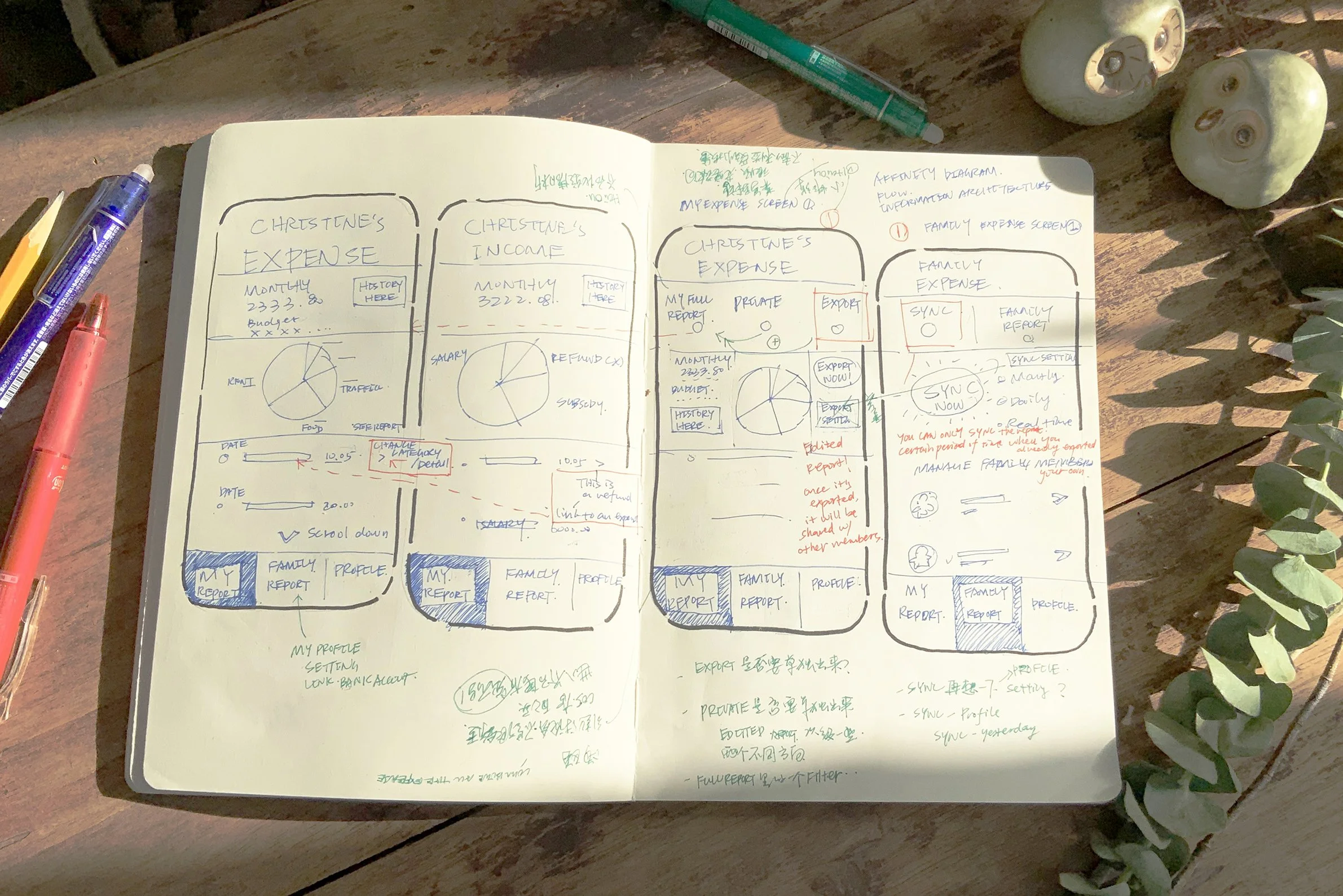
Based on the affinity diagram, the first prototype was developed. It includes a personal expenditure report screen and a family expenditure report screen. There were 2 proposals for the family report part, the 1st was with all the settings under the family report menu, and in the 2nd all hte settings were under the profile menu.
Findings
In the 2nd round of interviews, potential users all preferred the 2nd proposal as the information were more clearly presented, and that once set up these factors should not change often.
Information Architecture
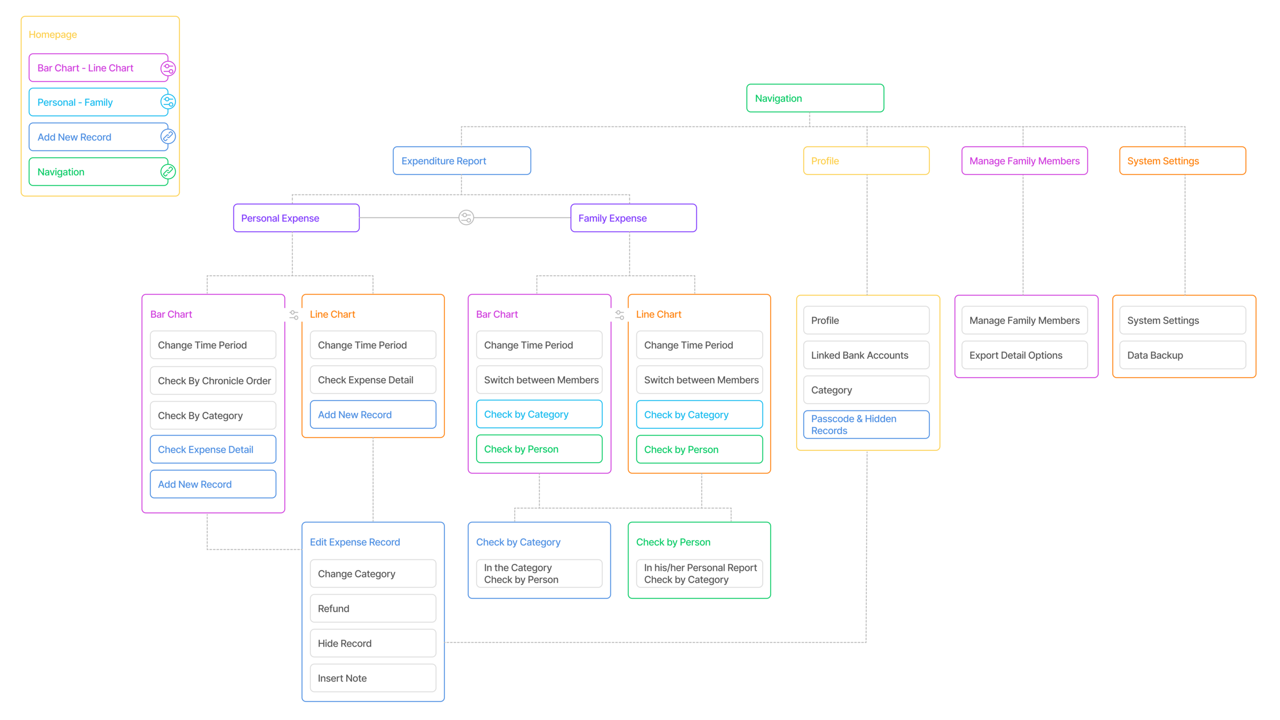
Based on the work of affinity diagram and low-fi prototypes, I was able to set up the structure of all the functions and information needed in this app.
Mid-Fi Prototypes - Proposal Comparison
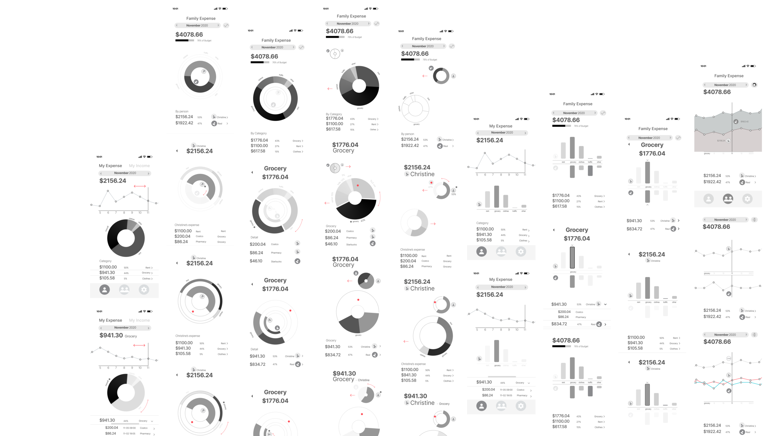
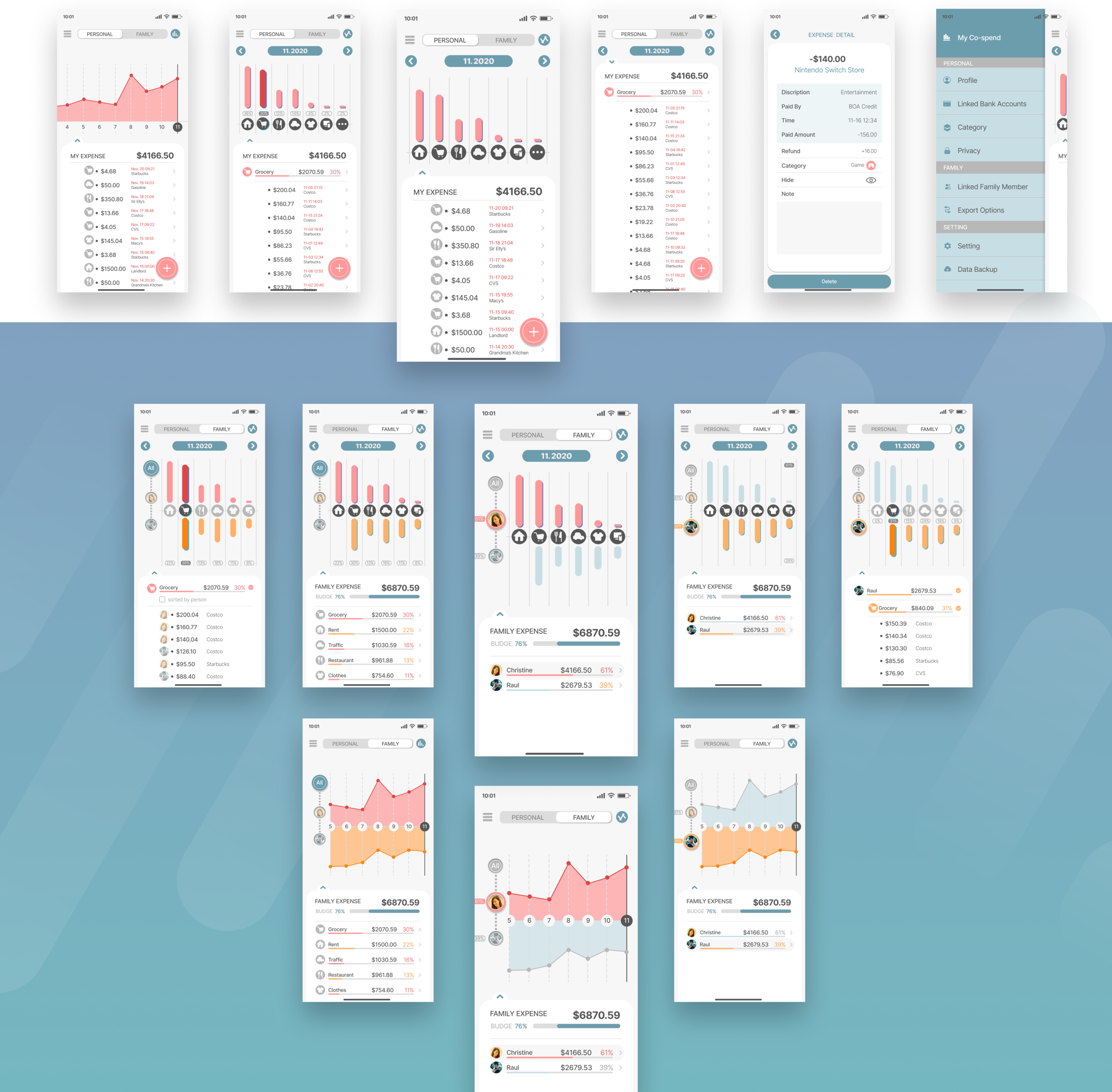
In the Mid-Fi stage, further studies for data visualization of the were made to find out which conveyed the information in a clear and understandable way. The 1st option was developed based on pie charts which were commonly seem in financial app; the 2nd one was developed based on a configuration that made the spending of each of the couple easy to read.
To show the changes of the expenditure over time, the app also offers line chart analysis, with 3 prototype proposals.
Findings
The bar chart proposal was not as direct as the pie chart in the personal spending page, but a lot more direct in the family spending page. It had win overwhelmly in the 3rd round of interview.
For the line chart, the 1st one was the most welcomed by interviewees.
Hi-Fi Prototypes - Privacy Protection and Customization
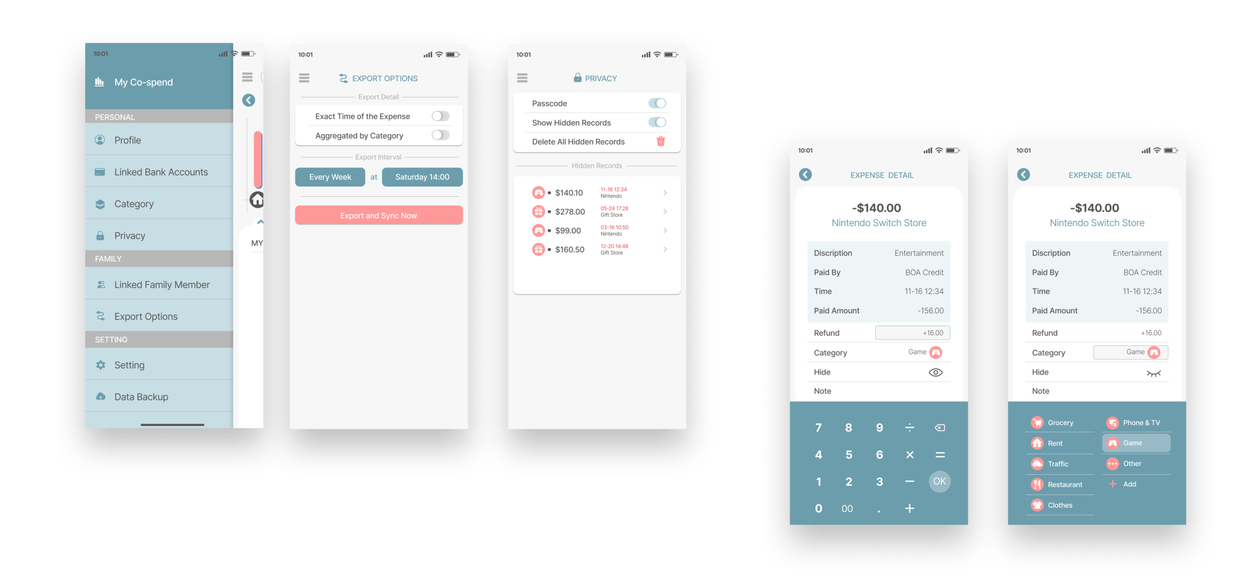
This was worked out through the “hidden” option in expense detail page, and also the “export” setting in which users can choose to aggregate all details when exporting, leaving only the category and number of the expense. These custom options also allows couples to share their most detailed original records if that is what they prefer.
A Holistic Report with Clear Visualization
This requests that users can choose freely check in certain period how much was spent in total, as well as in certain category and by whom. The bar chart gives a clear view about the distribution of the expenses, and by clicking on the graphics, the matching expenditure will immediately show up underneath.
Color Pallette
The challenge for the color pallette was mainly about how much contrast the colors representing different person in the charts should have. Strong-contrast colors resulted in tension between the 2 main members of the family, which was obviously not favored. Finally, a pair of similar colors, pink and orange, was chosen as the main colors to represent the couple; the secondary color, which was used mainly in systematic settings, was a desaturated cyan.
UI Details
The expenditure report page should be able to switch conveniently between bar charts and line charts, and also between personal private report, family expense report, and each person’s expense report. To archive that, different sets of buttons were designed on the screen to allow for quick, direct switches.
